You can easily create a notebook or journal as an element for your kits from scratch - follow along with this tutorial to find out how!
You will need a paper texture you want to use for your notebook pages, or you can
download mine from Mediafire. Included in the zip is the page border brush you can use, drawn by me in Illustrator. Both these resources are free for any purpose, commercial or personal with no credit required.
1. Start by opening up a new document at the size you want your notebook to be. Leave a little extra space around the edges for room to work. I'm going to use an 8x8" @300 ppi document, but my finished notebook will be a little smaller than that.
2. First I'm going to draw the shape of the open cover using custom shapes. To ensure perfect symmetry, we're going to use one shape and just copy it to create the other shapes - this is much easier than trying to draw the same shape freehand twice. I'm using custom shapes rather than pixels because this makes it possible to stretch and mold them without worrying about pixellation. Press "U" to get your custom shapes tool. Choose your rounded rectangle tool and ensure that your tool bar at the top is set to draw a Shape Layer. For this example, my corner radius is set to 40 pixels.

3. Drag on the canvas to draw your first cover shape. With the layer selected, press CTRL-J to make another copy of the layer. If your Smart Guides aren't already on, turn them on by going to View -> Show -> Smart Guides. These guides will help you line up your layers. You should also have snapping turned on. Go to View -> Snap and if there isn't already a check mark beside the option, click it to turn it on. Press V or select the move tool. Click and drag to position your two shapes so that they are perfectly aligned and touching each other on one side.

4. Make another copy of one of your shapes by pressing CTRL-J again. Press the V key to get to your move tool. If you don't already have it checked, select "Show Transform Controls" at the top of the toolbar. This will add some control points around the bounding box of the shape that will let you resize the object on the fly. Hold down your shift key and click and drag on any one of the four corner points around the rectangle. Drag the mouse inward just a little to make your notebook page a little bit smaller than the cover. Press enter when you're done to commit the change. Using your move tool again, slide the rectangle back up into place so that it's centered inside the cover shape and touching the inside border.

5. With your new page layer selected, press CTRL-J again to make another copy of the page layer. Just like with the cover, position it beside the other page layer and touching the inside border. You should end up with a shape that looks like the example pictured here. I've recolored all of the shapes from the default black to make it easier for you to see how I've laid them out.
6. Open up the paper texture you want to use in a new window. Press CTRL-A to select the whole image and CTRL-C to copy it, then go back to your notebook document. Click on your first page layer and press CTRL-V to paste it. Do the same for the second page layer - select it and paste another copy of the texture. Your layer stack should like mine when you're done. Don't worry if the textures are covering everything up - we'll fix that in a minute. I've manually re-named all my layers so it's easier to understand and work with, but you can skip this step if you want.

7. Hold down the ALT key and hover your cursor over the dividing line between the paper texture and the page shape layer in your layers palette. When you see an icon that looks like a lock with an arrow pointing left, left click once to clip the texture to the shape layer. Repeat for the second page. Your layer stack should now look like mine pictured here. Notice how there are now arrows beside the texture layers pointing downward. This means they are clipped to the page layers. You can still move, resize or transform the textures. If they aren't lining up the way you like, feel free to use your move tool to position the textures however you like.
8. Now we need to add shading to our pages. Normally when a book is laying open, the pages fold in toward the spine of the book where they are bound. This makes the center a little bit darker and there is also normally a hightlight right beside the dark area where the pages are a little bit higher off the cover surface. We're actually going to use several gradient overlays to create our shading. Although we could do this non-destructively by creating gradients in layers above and clipping them to the pages, I'm going to use a simpler method here since our book is going to be distributed as a flattened element when we're done anyway.
9. Make sure that your book and cover is the final size you want for your element. We will be rasterizing our layers beyond this point and we will not be able to upscale them without pixellation.
10. Starting with the lowest page layer in the stack (page 2 in my example), merge your paper texture and shape layer one a time by CTRL-clicking on the texture layer and the shape layer and merge them by right-clicking and choose Merge Layers. Don't select and merge all four layers at once - do each page seperately. Repeat for the second page so that you end up with two rasterized page layers like you see in my layer stack.
11. We're going to start with a color burn gradient on our pages to create an interesting color effect. Press the D key to reset your swatches back to the default black and white. Select either one of your page layers and click the layer effects button to bring up the menu (looks like an "fx" icon at the bottom of your layers palette).
12. Using the default black-to-white gradient you can see that the effect is much too harsh at first. Because I'm working on the right hand page first and I want the darkest part of my gradient to start at the spine of the book, I've set the angle to 0. These settings still need some tweaking, though, because they are pretty unattractive by default.

13. When you have your gradient overlay layer styles menu up, you can actually move the whole gradient on your canvas. Start by moving your layer styles menu out of the way a bit so you can see your canvas as well. You can click and drag on the title bar of the window to move it. Now when you put your cursor on the canvas, it will look like the Move tool icon. Click and drag on the canvas to move the gradient. Because I'm working on the right hand page, I've moved the gradient to the left just a little bit to get the harshest part of it to disappear. I've also reduced the opacity to 90% to soften it up a little. We don't have to worry about the white part of the gradient showing on the page because the "color burn" blend mode we're using knocks white out entirely. I think this looks pretty good so I'm going to press ok to accept.
14. Repeat using the same layer style and same method of moving your gradient on the other page. Remember that your gradient angle will need to be set to 180 instead of 0 to get the black part of it starting at the spine, and you will need to move your gradient to the right instead of the left (if you're following the same order of pages as I am). You don't have to copy the gradient style exactly - a little bit of difference between the two effects will help to minimize the "computer graphics" feel of the piece and give it more realism.
15. We need to layer over at least one other gradient and optionally a third one after that, but we can't do that right now because we already have a gradient overlay effect and no layer can have more than one effect of each kind at any time. So we need to "flatten" the effect and make it part of the pixels of the layer instead of just an overlay.
16. An easy way to do this if you have the option available is to go to File -> Scripts -> Flatten All Layer Effects. You can also create a blank layer beneath each of your page layers and Merge each page layer Down on to the blank layer. This is pretty much exactly what the Script does automatically. This makes the overlay an inseperable part of the pixels on the layer, allowing us to add another gradient overlay through the layer styles menu.

17. If you've changed your colors, press D to reset them back to default again. Select one of your pages (I'm starting with the righthand page again) and bring up the gradient overlay layer effects menu. Here I've added a multiply gradient with an angle setting of 0 because I'm working on the righthand page. I've moved the gradient to the left the same as I did for the color burn gradient, but here I've also changed the scale of the gradient. This gradient is intended to recreate the shading that appears on the books' pages near the center of the book. I don't want this shading to reach as far across the page or be as blurry at the color burn gradient and changing the scale of the gradient helps tighten up the colors and put them closer together, which decreases the smoothness of the gradient blend. Again, we don't have to worry about the white part of the gradient because the multiply blend mode also knocks out white. The page is starting to look more realistically shaded.
18. Repeat the same layer style on the opposite page. Remember to change your angle settings and again, don't worry about matching the shading exactly - a little bit of asymmetry adds realism.
19. Repeat the operation in step 16 to flatten your layer styles again.
20. You can stop here if you like the look you've achieved and skip ahead or you can add one more highlight gradient to add even more realism. Press D to reset your swatches, but this time click the little arrow above the color boxes in the toolbox on the left to switch them and get white as your foreground color. Bring up your layer styles menu and copy my settings to get a thin, isolated strip of white gradient that you can position beside your shadow shading to get a slight highlight where the page would form a bit of a "bump" if it were laying open & flat. Because it can be hard to see, I've drawn a box in the image to show you where I positioned my highlight gradient. You will need to move the gradient manually like you have for the last two we created and positioned. Repeat for the other page. Flatten your layer styles as in step 16 when you're happy with the position and opacity of your gradients.
21. Copy each of your pages twice by pressing CTRL-J on each page twice to get two copies. Because all the copies will be stacked above your original, for convenience you'll just leave your highest copy (Layer 1 Copy 2 for example) in its original position as the page we see, and the other two will form some detail at the edges.
22. To create my example, I'm going to select the second copy down for each page (Layer 1 Copy 1 and Layer 2 Copy 1) and Nudge them 5 pixels to the left for the left page and 5 pixels to the right for the page. To nudge the layers, have your Move tool selected by pressing V and click the layer in the layers palette to select it. Use your arrow keys to nudge the layer by pressing the key 5 times.
23. Do the same for the last two layers, Layer 1 and Layer 2, but this time nudge them to the left and right by 10 pixels. Your top copy of each page should now be in their original positions, and the two below them should be moved over by 5 and 10 pixels for each level. For realism, you can change up how far you nudge the pages. You can use different increments for each side. They don't have to look perfect and even - in fact a little imperfection can be even better.

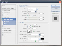
24. Add a drop shadow layer style to all six page layers. You can do this quickly and easily by setting the style on one layer, then right clicking on the word Effects and choose Copy Layer Style. Then select all the other layers by CTRL-clicking each one or click the first and shift-click the last in a continuous series. Then right click and choose Paste Layer style. This sets a light drop shadow to give some definition to the edges of the pages. Tip: Use a different angle setting for each side of the page. To do the lefthand pages of the book, I used an angle of 30 degrees and for the righthand side 130 degrees. I don't want my shadows building up too thickly in the well of my book spine, so I need to direct them away from it. To keep the light source from being overriden for all your layer styles, make sure you untick the Use Global Light setting like you see in the screen shot.
25. Your book pages are done! All that's left is to add a bevel & emboss layer style to your cover layers and do a quick quality check. If you've left enough of your book cover showing beneath the pages, you will not have to worry about shadow bleed because the shadow style should be very small and soft and not spread beyond the cover to bleed outside of the shape. If your covers are too small, they should still be custom shapes which will allow you to enlarge them and still maintain quality at this point if you want to.
26. Here's how I styled my book covers:
27. And that's it! You can download my plain book example from the link below to embellish. You can add border designs, ribbons, journaling lines, cut out parts of it to make a frame, add staples, stiches or eyelets to the spine, whatever you want! If you follow the tutorial and design a book yourself from start to finish, you'll also have your own layered template that you can use to put things in between the pages if you want for a really interesting touch.
Download Book from Mediafire Here


